Redesigning Navigation for 50+ Languages
The beginning.
Its fairly simple from the outside: 59 languages, 90+ websites, half a billion visits / year and the mobile numbers keep going up and up.
From the inside: navigation/header made for a responsive time, but falling behind on mobile devices.
The problem
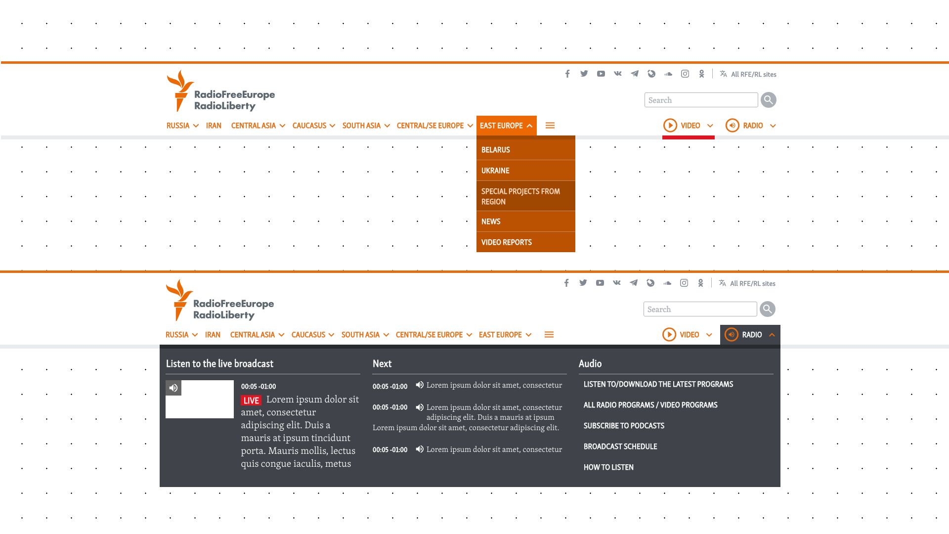
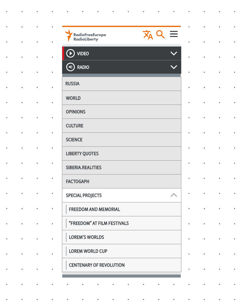
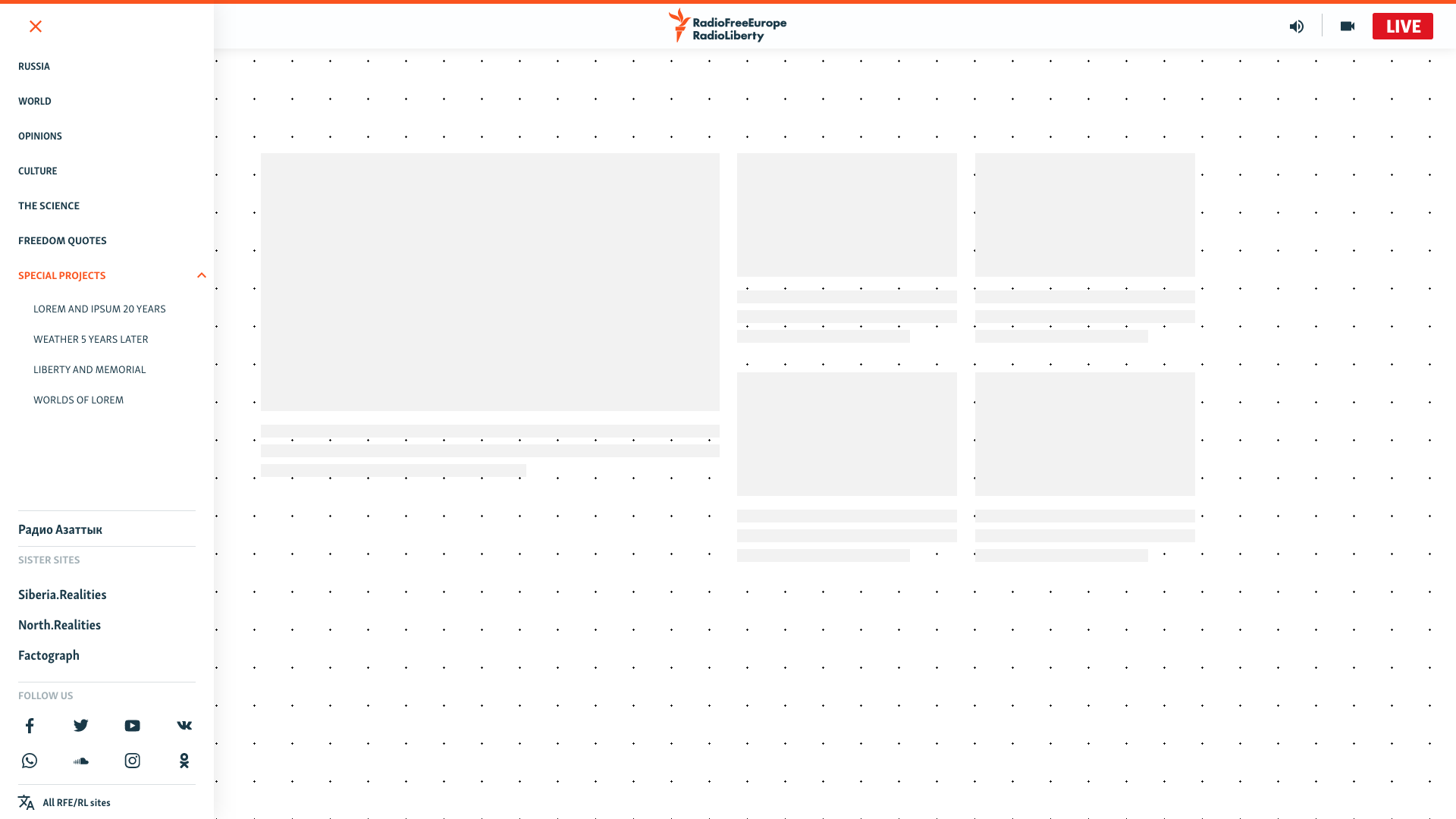
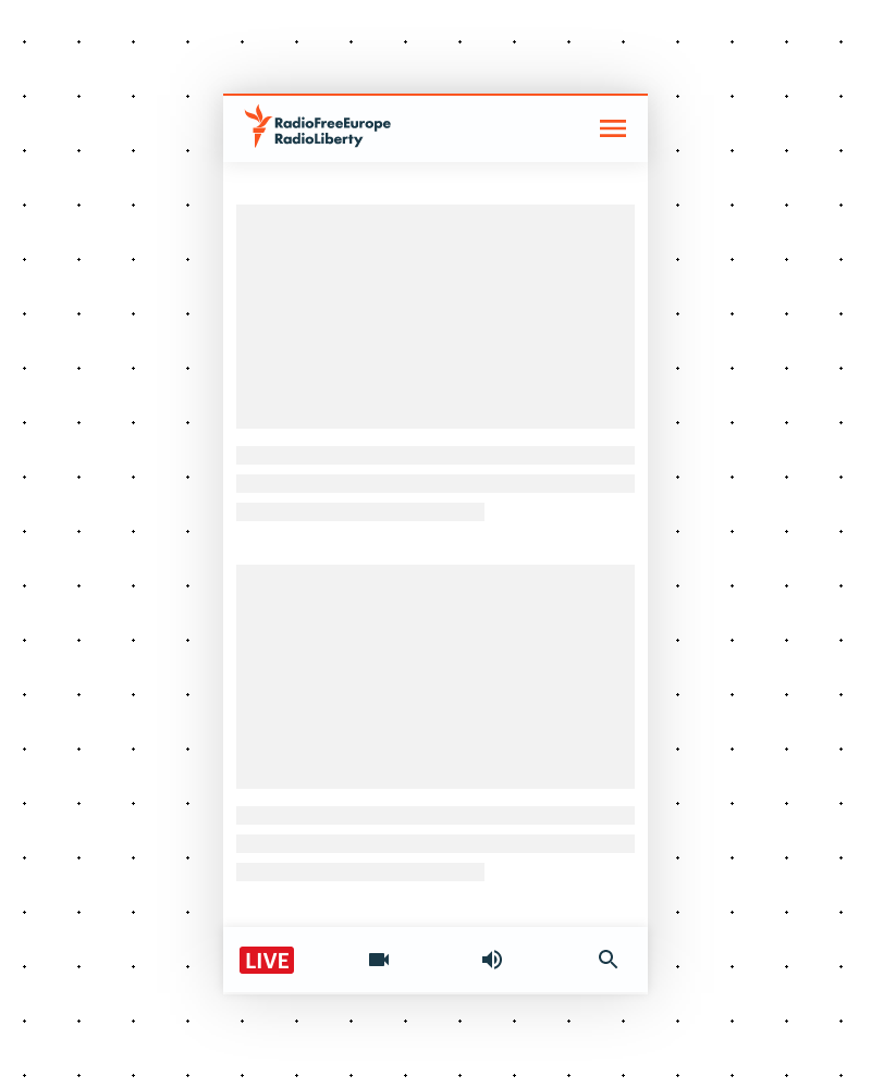
The existing navigation was a mega-menu system. On desktop, a lot of subcategories, big drop-downs and lots of them. Media items that had full page dropdowns with Live channels, broadcast schedules, show descriptions etc. Just going through the menu one could basically cover half of your screen in the various menus and categories. It was usable, but it could be better.
*Lorem needed in screens as to not show real news or it to be mistaken for such.
On mobile? Even worse.
All of that complexity collapsed into a nested accordion. Open one section, the previous one closes — a necessary compromise because if everything stayed open, the menu alone would have been longer than the actual page. Users would be scrolling inside the menu just to find what they were looking for. And even with the auto-closing behavior, it was still painfully long on a phone screen.

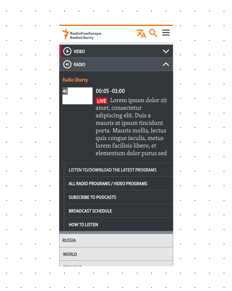
The design wasn’t neglected — it just came from an era when mobile wasn’t the primary screen, and devices and networks weren’t powerful enough to handle more sophisticated data. Our regions had moved on. The nav hadn’t.
The data we had
We had analytics. We had heatmaps. Users weren’t going deep into the menus. They engaged with the top-level categories — the parent items — but almost never clicked through to the children. On mobile, the pattern was even more stark: people opened the menu, interacted with whatever was immediately visible on their screen. The navigation was offering all this depth and complexity, and users were essentially ignoring most of it.
No screens of analytics sadly
Scope: Not just one site
Here’s where it gets interesting — and honestly a little intimidating even thinking back on it.
This wasn’t just about RFERL.org. The new navigation had to work across RFE/RL and multiple other organizations and dozens of language services. That meant designing for 50+ language services. Each with its own editorial team, content strategy, and audience.
From day one, even in my earliest sketches, this had to be a navigation system that could handle all of them. That meant accounting for:
- RTL languages like Persian and Arabic, where the entire layout mirrors
- Wide scripts like Georgian and Armenian, where a single word can eat up significant horizontal space
- Logographic-derived scripts like Simplified Chinese, with completely different typographic behavior
- And of course Latin and Cyrillic scripts in various flavors
I built my core concepts around four representative languages: Russian (most used), Persian (RTL), Georgian (long characters), and Simplified Chinese (symbols).

The Process: Design first, Permission later
I’ll be honest — I started this project before it was a project. I was designing on my own time, driven by that that mega nav. When I felt like I had something worth showing, that’s when I started the conversation with product managers and my team.
Once it became an official initiative, we did things properly. We ran a content audit across services — we needed to understand what each language service actually wanted in their navigation. And here’s where our unique position helped: as designers and PMs, we also acted as consultants for these language services. They came to us regularly with questions about content architecture, layout decisions, site structure. So our understanding of how each service operated was built on years of working alongside them.
We knew that some service focused on straightforward news categories with subcategories. We knew that some services ran special reports and needed to rotate nav items almost weekly. Others were more media-heavy, prioritizing audio and video over text content. Also on top, we had some communication from editorial management about the overall direction of the org’s.
All of this informed the design — not as assumptions, but as organizational knowledge validated by real working relationships.
The meetings. (Oh, the Meetings)
Here’s the part no one warns you about and no one wants for something this size: the migratory meetings.
Once we had a solid direction, we had to present the new navigation to each language service, listen to their feedback, address concerns, and get buy-in. One by one. Across dozens of services. With news teams that have breaking news almost every hour.
Try getting a one or two hours free spot in their day, to look at “pretty pictures” when there’s a developing story they should be covering. It was… a process.
The resistance wasn’t so much about the design itself. Most teams could see it was an improvement. The anxiety was about specifics: “Can I still show this item here?” “What about this special section we run?” “Where does our live coverage link go?”
Some of those conversations led to real changes. We carved out special areas within the nav that we hadn’t originally planned. And some conversations rippled way beyond the navigation — the redesign brought some other changes in not only the re-thinking of navigation but went deeper into our systems, which absolutely took me by surprise. Those changes are not my main focus here, but still was a nice thing.
The nav redesign became a catalyst for bigger conversations about our content. That wasn’t planned!
The Solution: Get out of the way
Two core principles drove the final design: mobile first and let the content shine.
The Structure
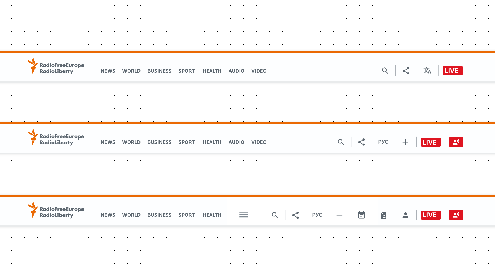
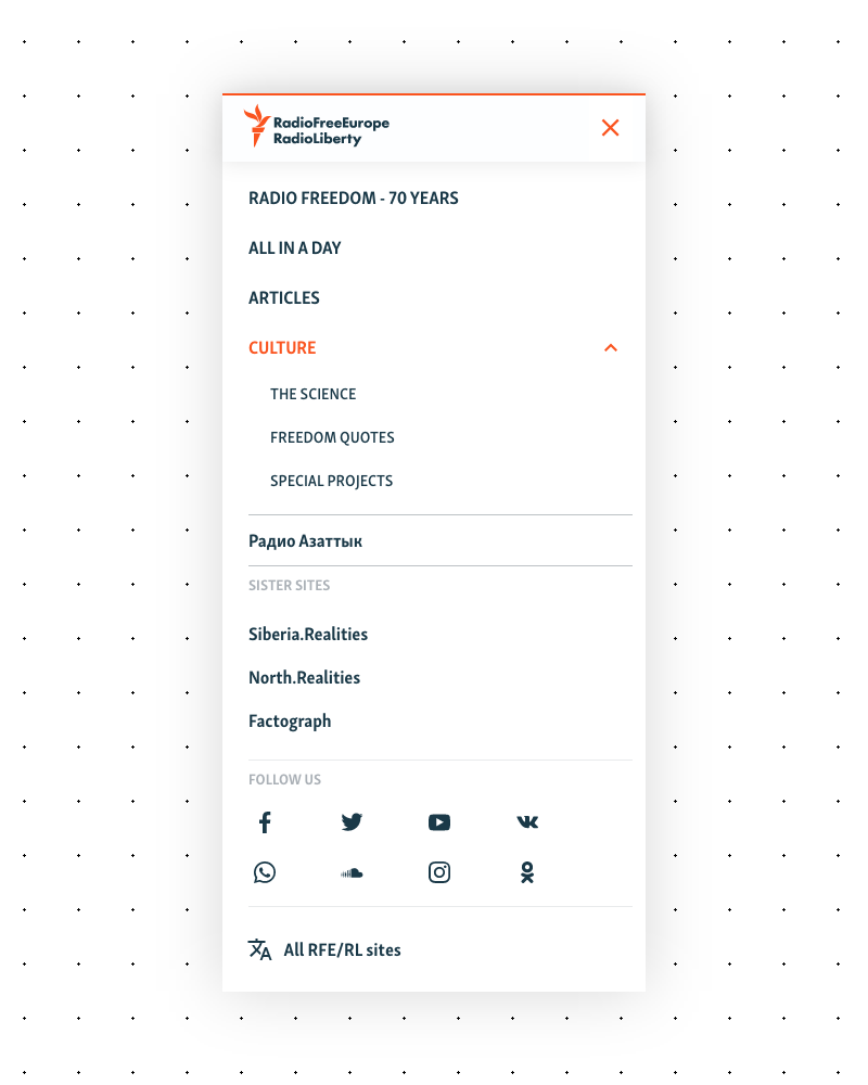
We replaced the mega-menu with a simplified header and side panel navigation. I ultimately landed on a type of surface treatment.
The side panel contained:
- Main sections — categories and subcategories, giving editorial teams full control over what they display and how much
- A special area for projects, sister sites, or secondary language sites
- Follow us links for social channels
- A link to our language page — a directory of all language sites
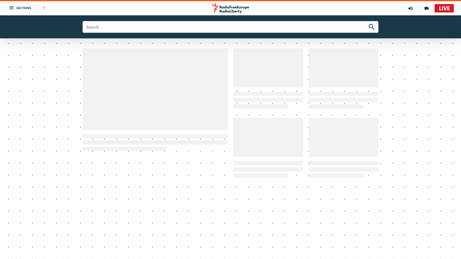
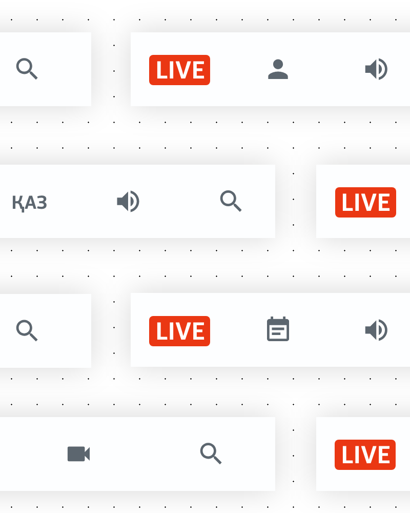
The header itself was stripped back dramatically. On one side, the hamburger menu trigger. On the other, quick-access links — initially audio and video page links, plus a prominent “LIVE” button for live broadcasts, but conceived as a modular space.
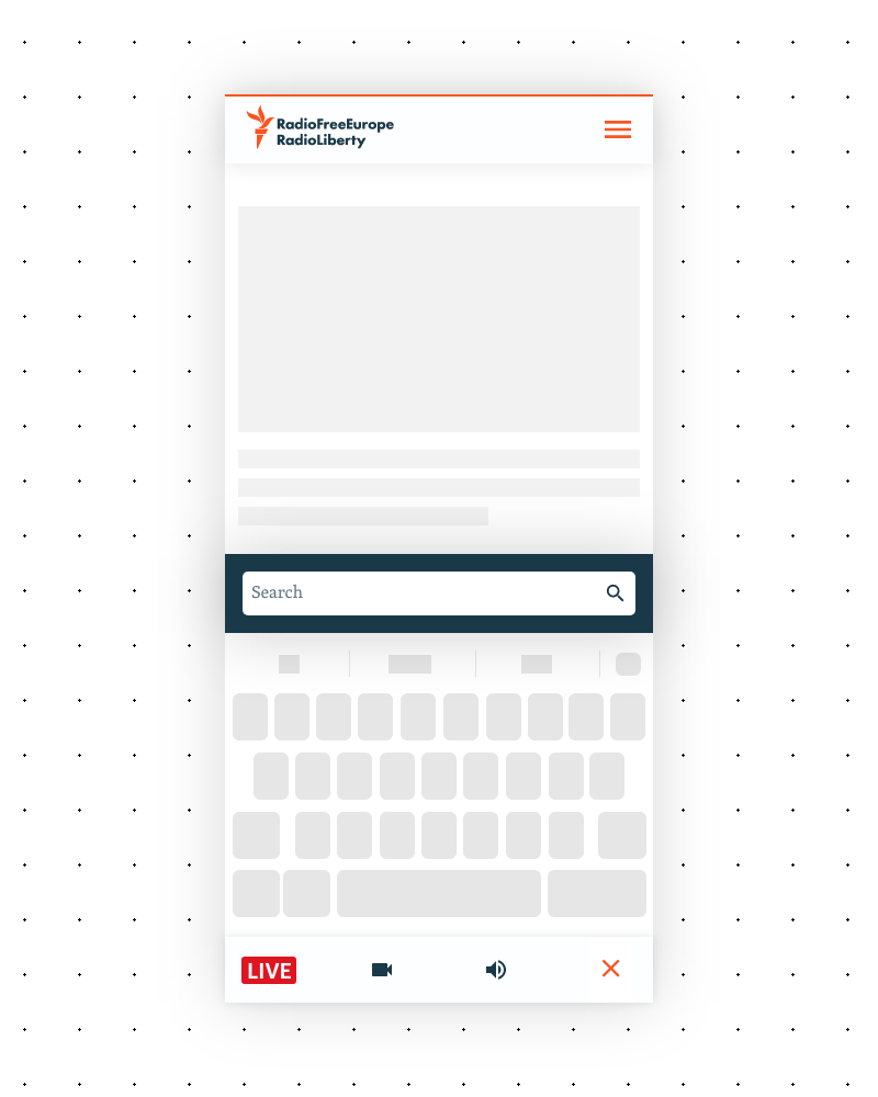
Mobile: The Action Bar
On mobile, the side panel becomes a full-screen overlay. But the header gets split into two elements:
- Top: Logo and hamburger menu
- Bottom: A sticky “action bar” anchored to the bottom of the screen, housing the quick-access items from the desktop header’s right side
This put the most important actions right under the user’s thumb. No reaching to the top of the screen to access live content or media pages.
The Behavior
Both on desktop and mobile, the navigation hides when the user scrolls down and reappears when they scroll up. The nav gets out of the way when you’re reading, and comes back the moment you need it.
This behavior had an unintended side effect: it nudged editorial teams to put more care into their on-page content. Without a massive mega-menu dominating the viewport, the content had to stand on its own. The nav was no longer a crutch or a distraction — it was a tool you reached for when you needed it.
Editorial flexibility
A hard constraint from the start: we could not touch editorial decisions about the nav. The new navigation had to let each service show as many or as few items as they wanted. A service that needed three categories got a clean, minimal nav. A service that needed fifteen subcategories and a special reports section got that too — without the system breaking.
That said, we had data on our side. We could (and did) make recommendations backed by analytics and heatmaps. We couldn’t force editorial choices, but we could nudge them in a direction that served their users better.
My Biggest Regret
I’m proud of this project. But there’s one decision that still bugs me.
The action bar on mobile — we made it icon-only initially. The reasoning made sense at the time: we needed it to be modular so editorial teams could swap icons (replace video with podcast, for example), and we were worried about text labels across 50+ languages. We couldn’t control the copy, some languages produce much longer words than others, and we were concerned about things breaking on smaller screens.
What we failed to consider was that modern mobile screens are high-density. There was more room than we assumed. And from our years of working with these editorial teams, we knew they were generally willing to reformulate labels if we told them the wording was too long. We had the relationship and the trust to make text labels work — we just didn’t push hard enough on the idea.
It’s a reminder that constraints are sometimes less rigid than they feel in the moment. We solved for a worst case that, in practice, wouldn’t have been that bad. Icon-only works. But icon-plus-label would have been better.
The Rollout
The whole thing — from my first designs to the last language service going live with the new nav — took nearly two years.
That timeline reflects the reality of designing in such an organization. The design and prototyping phase was one part of it. But rolling out across RFERL and other media org, service by service, for each a meeting, editorial adjustments, and implementation timelines — that’s where the time went.
It was a gradual rollout by design. Service by service, so we could learn and adjust as we went, and so editorial teams had time to get comfortable with the new system before it was live for their audience.
Not finished!
Its been several years already since this rollout and our attentions went to other projects, i know the front end is not finished and in need of other improvements. I am currently starting again focusing on the front end and further changes will come. Some will be more of a cleaning up, some will be a drastic change. Overall i know that this process is starting again and i’m bracing myself.
This was as much frustrating as rewarding!
Thank you!